Beige walls are the most traditional, versatile and at the same time elegant option for wall decoration in living rooms, in the kitchen, office and library.
Regardless of the intensity, all the tones from this palette look noble and allow you to experiment as much as you like with zoning, placing accents and accessories.

What color curtains should I choose to match beige wallpaper or plaster?
Light beige immediately adds “air” even in small room. It enhances illumination, expands the space, does not catch the eye, allowing you to focus on the furniture and decor.

According to color psychology, beige is associated with peace, warmth, comfort and regularity. This color is noble: it was painted in flesh tones ancient Egypt figurines of gods, clothes of shade Ivory worn by nobility in India. According to Feng Shui, beige represents well-being and happiness and is suitable for all rooms without exception.

The shades in this range are neutral, which means you can combine any colors with them - including intense reds, deep darks and even some neon tones.


To prevent powdery and nude tones in the decoration of a room from looking boring, you need “correct” curtains - ones that match the shape and composition of the size of the room, the furniture and other features of the room.


The beige palette includes a huge number of shades that differ in richness and warmth. So, the lightest tones of this range include cream and vanilla with a yellow undertone, linen, and ivory. They are ideal for small spaces and are appropriate in almost any interior, including avant-garde or in the traditions of Japanese minimalism. Under such light beige walls you can choose curtains of delicate pastel shades- lavender, peach. Such combinations are the best solution for the bedroom.


In the living room with Scandinavian interior beige goes perfectly with gray and silver. For such a fashionable design, you can also choose tulle complete with linen, deliberately rough curtains.


Curtains in moderately dark chocolate-wood tones are also suitable for light shades of beige wallpaper.


It is better to avoid strong contrasts - they look too sharp. If you want to experiment with bright colors, you can use turquoise or azure curtains for light beige wallpaper.


Dark beige walls in the hall or office harmoniously combine with dark ones or, conversely, more light curtains. The main thing is to avoid matching tones: it blurs the decor of the window opening and makes the interior boring. Deep shades of beige include ecru and almond. White or smoky silver textiles are suitable for them; you can choose curtains with satin gray drapes or purple curtains.


Wallpaper in cool beige shades looks especially elegant in modern and high-tech interiors. These include abalone, "silver fox", smoky white and tone " sea shell" Textiles in smoky, watercolor and metallic shades will help reveal the beauty of this palette.


Curtains in an interior with beige walls and brown furniture cannot be too bright and colorful. In such a conservative environment, textiles in shades such as chocolate, walnut, cappuccino, baked milk. For example, you can choose curtains with curtains in similar colors, complete with white or milky tulle.


To choose the right curtains for a room with beige wallpaper or plastered walls, you need to take into account the size, configuration and other features of the room:


Multilayer curtains with cascading elements, tucks, lambrequins and heavy curtains are suitable for rooms with beige walls of sufficient area. The same goes for curtains with large floral and ornamental patterns. By the way, catchy prints with texture and multi-colored elements are appropriate in rooms with plain beige walls - this window design will become the main accent.


You can choose beautiful designer and inexpensive curtains for a room with beige walls in the collection of the Tomdom online store.
Wallpaper is a classic technique for decorating the walls of any living space. Classics in the usual sense today occupy a leading position: beige wallpaper is in fashion. Despite the calmness of the color, it is responsible for many design decisions; it is a royal choice, speaking about the status of the owners of the house and hinting at their refined taste.


The beige color is equivalent to white; it has a calming effect, promotes a relaxing atmosphere and maintains home comfort. Beige wallpaper They never get boring, unlike their bright, contrasting counterparts. The effect of hue is scientific fact: beige tone stabilizes emotions, relieves daytime stress, calms the psyche, while bringing warmth into the space. Such wallpapers are chosen by soulful natures, people who are characterized by calmness, reliability and the ability to maintain neutrality in any situation, even stressful situations. This is the choice of confident and practical people for whom harmony comes first.
If someone thinks that this color is boring and devoid of beauty, his opinion is wrong: most likely, in this case, the tone does not match the interior composition, because the shade corresponds to a high status; it compares all furnishings with itself.


Beige wallpaper – universal method wall decoration.
They have a lot of advantages:


Beige wallpaper is a classic of all existing wall coverings. They are available in roll, powder or wet form. finishing materials. Among the mass of categories that differ in the type of fiber, texture, thickness, number of layers, their density, several types of finishes, which have their own pros and cons, are especially popular among buyers.


Other interesting varieties include bamboo and cork wallpaper. In this color they look gentle: the natural shade opens up a lot of design possibilities without interrupting the overall harmony of the wallpaper layout with decorative items.


Deserves special attention self-adhesive wallpaper beige color: they are a unique finish that allows you to update furniture (chairs, cabinets, walls, tables, kitchen sets), doors and doorways, decorate mirrors and decorate glass with stained glass, if made in a translucent tone.
In addition, with the help of beige wallpaper of this type, you can create stylish furniture ensembles from disparate furniture, which is especially appropriate in the kitchen or in a children's room, replete with elements of different styles.


The uniqueness of beige canvases lies in the fact that the shade is an ideal basis for any pattern. At the same time, it does not interrupt the mood of the room, does not hide the space, can be applied with embossing, relief, spraying, photo printing, or have additional decor (for example, glitter or crystals). Design techniques are based on the use of an interesting texture (which is especially fashionable today) and an original print. This allows us to find an approach to each customer, taking into account even the most demanding preferences.


The texture of the wallpaper can be varied:


Through an interesting texture, you can emphasize the uniqueness of the style, especially if the surface of plain wallpaper imitates a different material.


Colors today receive a lot of attention, so they are appropriate in different styles, featuring a premium look.
The most interesting designs worthy of attention are the following wallpaper colors:
Small stripes and polka dots are considered an unsuccessful technique: striped and polka dot walls create ripples, they quickly become boring, even if the pattern is not made in sharply contrasting colors.
Despite the versatility of the combination, some strong colors, when added to a beige base, can add heaviness to the room. Therefore, the color of contrast must be approached with all responsibility: the appearance of the entire environment depends on it. The beige tone can balance stylish tones(brown, crimson, red, pink, turquoise colors), it can be combined with any natural colors (green, blue, mint, mustard).
The main thing to consider is that the shade should dominate. You cannot complement it with flashy contrasts: the combination must be soft, otherwise bright shades will draw all attention to themselves.


Golden-beige wallpaper with embossing, textured canvases with a light beige background and a brown pattern, look beautiful in the interior, no less stylish finish are plain, soft beige wallpaper.


Of the most successful combinations You can note the combination with the following shades:


Since beige is the basis of the style, it cannot be complemented by a similar tone of furniture and curtains. This approach lacks taste and makes the interior dull. Light spots in the decor need to be diluted, because the same color will merge. Wallpaper natural paints beige and brown tones without dark spots bring boredom into the environment. You should not tint the walls and kitchen apron identical: this way the given zone will lose emphasis.
It is important to start from the main shade of beige (cream, opal, cappuccino, biscuit, caramel, powder). This will allow you to choose the contrast most harmoniously.


If a light shade of beige is chosen, one of the walls is decorated with an expressive coffee contrast, it is better to choose furniture (sofa and armchairs) in lilac with a bronze finish. If flooring light, you need to lay a dark carpet and install dark-colored furniture in the room. Doors should echo the dark wood contrasts. Instead of lilac contrast, you can use turquoise, terracotta, burgundy-pink.
If the situation is based on bright hues(for example, white, yellow), you can’t do without dark brown and black contrasts: it is important to add a couple of bright touches to the interior composition in the form of, for example, a doorway, mirror frame, tiles, cabinet or coffee table.


Pasting the same wallpaper is a thing of the past. To make the walls elegant and maintain a special style and status, you should pay attention to the combination technique.
Among the most interesting design techniques The following combinations deserve attention:


When choosing wallpaper in beige shades, you need to take into account a number of factors, among which the choice of a store with a good reputation, the required width, texture, compliance with the texture and type of surface, and the characteristics of the pasting are important. It is preferable to buy wallpaper meter width: when pasting the surface there will be fewer joints, which will protect against pattern mismatches and reduce the need for adjustment.
If you want gloss, exclude glossy ones from the list paper wallpaper: they simplify appearance furnishings (it is better to buy varieties with embossing).


In design, there is such a universal finishing solution, ideal for any style and purpose. It's about about beige wallpaper in the interior - a gentle, cozy and comfortable option that can be left in a laconic interpretation or diversified bright details. Find out how to choose the right wallpaper for your space in our article!
Colors are one of the main visual components that shape the atmosphere in the interior and the mood of people. Of course, it is important to be surrounded by flowers that match the taste preferences of the residents. But it is much more important to properly organize the space, highlighting its advantages, hiding its shortcomings, and also fitting it into the framework of the desired style.
Beige is first and foremost traditional solution for housing. If other, brighter shades appeared in homes along with modern stylistics, then beige has been present here since ancient times. It is ideal for classical trends, because it itself has a characteristic noble charm and severity.
But this does not mean that beige is rarely chosen in modern interiors. Here it is used to create a natural environment, gravitating towards nature and visual comfort.
Color promotes relaxation, rest, improves well-being, but at the same time helps to focus on important matters without distracting attention. Don't worry that such a design will seem boring and emotionless - beige goes well with other options, and its palette of tones demonstrates a deep variety of shades.
These include cream, nut, opal, caramel, and biscuit varieties. Even if you limit yourself to only them, you will be able to create a comfortable space.

Wallpaper is perhaps the most popular finishing option that can be changed without damaging the wall. They are distinguished by their relatively low cost, practicality and visual variability. Construction market offers to decorate the interior with a surface with a monochromatic design, various prints, textures or colors, including the entire palette of beige shades. But the main selection criterion is the material of the products, which affects the aesthetic and practical characteristics.
Thus, paper wallpaper remains the most budget-friendly and environmentally friendly type. They can be single-layer or double-layer, and rarely have relief. After just five years, the beautiful beige will begin to fade, the coating will absorb all the odors and will definitely come off somewhere. The fragility can be justified by the cost, as well as the ease of gluing.
Endowed with strength and moisture resistance vinyl wallpapers. They can be re-painted, hide uneven walls, but do not allow air to pass through. This type cannot be called environmentally friendly, which is why it is not recommended to use it in the bedroom or nursery.
Non-woven wallpaper has virtually no disadvantages, except for the high price. Products without a vinyl layer are absolutely harmless. They can be taken for gluing ceilings.
An unusual solution for any room will be liquid wallpaper, combining best qualities decorative plaster and painting. They do not leave seams when gluing, do not collect dust, and also have a deep texture that diversifies and highlights even the palest shade of beige.
Characterized by low resistance to any type of contamination textile wallpaper. But a covering made of natural silk, linen, cotton or velor will decorate rooms with a stable microclimate. And in combination with beige color and floral design will fit perfectly into the classic style.
Photo wallpapers are not taken into account, since they are difficult to select in a beige interpretation. In general, the choice depends on the space conditions, budget and the desired visual effect.


Interior decoration is not limited only to the use of beige wallpaper. They need to be placed in tandem with other elements, choosing a winning palette that will emphasize the calm nature of the color or diversify it.
You can wallpaper one side of the room with beige wallpaper, and paint the others in more neutral or bright shades. In this case, the texture of the material and the pattern play an important role, which can act as the main color accent. Let's consider the main combination options:
This combination includes the use different shades one color, in our case - beige. It offers the most comfortable palette for perception, in which, firstly, there are no bright inclusions, and secondly, there are various natural variations.
Furniture with white or gray upholstery, as well as curtains, look harmonious against the wallpaper. It is necessary to take into account that if the textiles have patterns, the wall covering should be plain, and vice versa. This will help balance the interior.
A wooden set will fit well, especially if it is a light-colored species. Despite the fact that you have to work with one color, it is recommended to focus on tonal contrast: wooden objects - muted wallpaper, white objects - rich beige wallpaper with texture.


The principle of this palette is extremely simple - bright details are added to the design, which are especially noticeable on the beige “canvas”. It is important to choose a combination that is pleasing to the eye.
If the wallpaper has a pattern of a different color, you should use it for textiles or decor. In other situations, it is recommended to focus on the beige undertone, which can be lilac, pink or even peach - this will provide guidelines for further searches.
The cool turquoise color looks unusual against the wallpaper, adding a refreshing touch to the interior. Green helps create a natural atmosphere that gravitates towards natural landscapes. Red will fill the space with warmth, and pink - tenderness. There should be few such details, otherwise the beige ones will get lost in the bright colors.


Wallpaper of a certain color is an important reference point in design, but the choice is not limited to it. It is necessary to take into account the purpose of the room, conditions, geometry and other elements to create an aesthetic design.
The living room is a place where you want to relax with loved ones, read a book or watch an exciting movie. This is where guests are often received, so in addition to home comfort, you need to think about the presentability of the central part of the house.
In spacious rooms, you can use wallpaper with floral patterns, geometric patterns or the usual “stripe”, which will visually raise the ceilings. To highlight the wall with the TV, we recommend painting the remaining partitions white - even beige will be noticeable against such a background.
Bright inclusions in the form of furniture or decor diversify the design, and neutral shades will hide the shortcomings of small living rooms.


Paper varieties in such a room are a very impractical solution, since they absorb odors and cannot be cleaned. It is better to focus on vinyl or washable types, selecting only high-quality products.
Wallpaper is used mainly to cover the dining area or the area that is located far from the stove. If the apron is plain, you can allow it to be finished with bright prints, thereby creating visual zoning.
Pay attention to the shade of beige: its palette includes options that are associated with food and would be extremely appropriate in the kitchen. For example, cappuccino, nut, caramel - stimulate appetite and also improve mood.


Environmental friendliness and ventilation play a role in the bedroom great importance and affect not only the quality of sleep, but also human health. Here you can limit yourself to paper or non-woven wallpaper, but vinyl should be left for more demanding spaces.
This part of the house is usually free of sources of pollution, so textiles with their natural texture will help create a cozy and comfortable mood.
The color scheme is usually more restrained and not full of bright details. For rooms with windows facing north, it is better to choose a finish with a cold undertone, and vice versa.


Beige color is an ideal basis for interior experiments, because it is versatile and well compatible. The variety of shades and textures of the flesh palette conceals a sea of different solutions that can take design to a new level.
Beige tones are classic and natural, therefore they have a positive effect on human psychology. This color is characterized by calm, warmth, tranquility, regularity, stability and harmony.

When used in the interior, beige has undeniable advantages:

Beige wallpaper amazes with its versatility: noble caramel, enchanting creme brulee, playful pearls, mysterious sand and much more. Each shade brings its own mood to the environment, especially when combined with other colors.


The entire palette, from wheat to ivory, pairs perfectly with pastels and dark warm tones and acts as a backdrop for richer colored furnishings.

The room looks harmonious in creamy white tones with the use of dark green shades and metal surfaces in furniture, paintings and textiles. This solution is especially relevant for the kitchen and bathroom.

Beige-brown wallpaper is classic version and bring conservatism, restraint and elegance to the room. Against such a background, it is permissible to use any accents: bright prints, contrasting furniture and accessories.

The following combinations are also winning:

Beige wallpaper with a print also looks interesting in the interior. On a warm pastel background, sophisticated silver patterns look expensive and luxurious, muted red floral patterns add rustic coziness, and geometric pearl lines give off respectability and formality.


In general, the versatility of nude allows you to combine it with any colors. The main thing is to maintain balance and be sure to add contrasting and intense accents.

The use of beige directly depends on the purpose of the room. In living rooms, caramel decoration is a win-win classic, giving the space comfort and sophistication. This color scheme will be optimal for eco-style, modern, high-tech, minimalism and rustic.

In small areas, it is recommended to give preference to light and light shades, slightly noticeable textures, soft upholstery, simple ornament, white ceiling and wooden flooring. In the spacious rooms any options are possible.

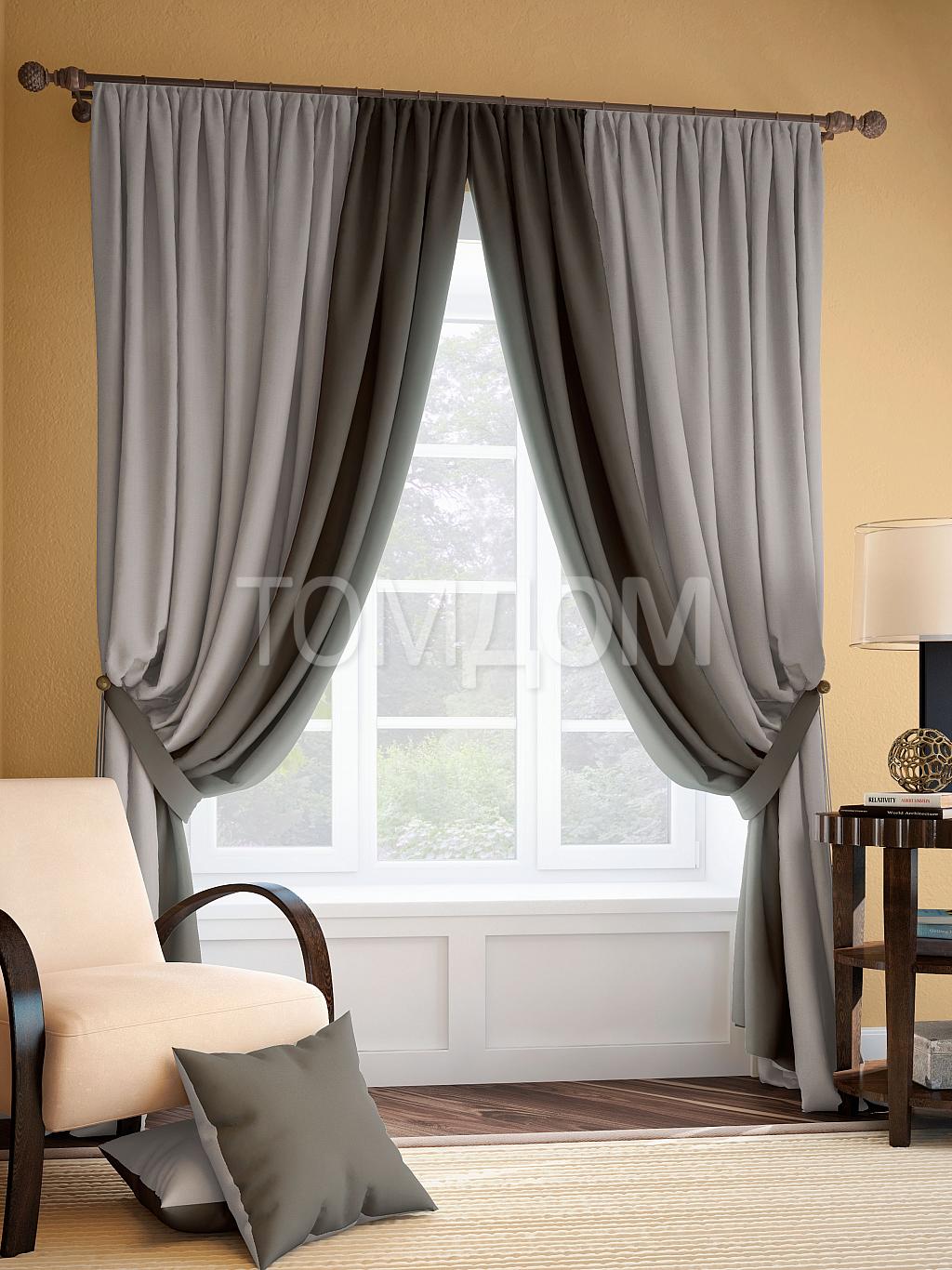
A solid design is selected for the kitchen to maximize the space. Light colors are also used for these purposes, with emphasis placed on the headset or wooden furniture. IN large rooms You can place brown and black furniture, which is complemented by gray curtains and dark appliances.

Double wall decoration is popular in the bedroom: combining white wallpaper on three sides and a central plane occupied by beige wallpaper with unusual design. More often, contrasting colors of the same color scheme are chosen for such rooms, making gold or gray accents on pillows, paintings and blankets.


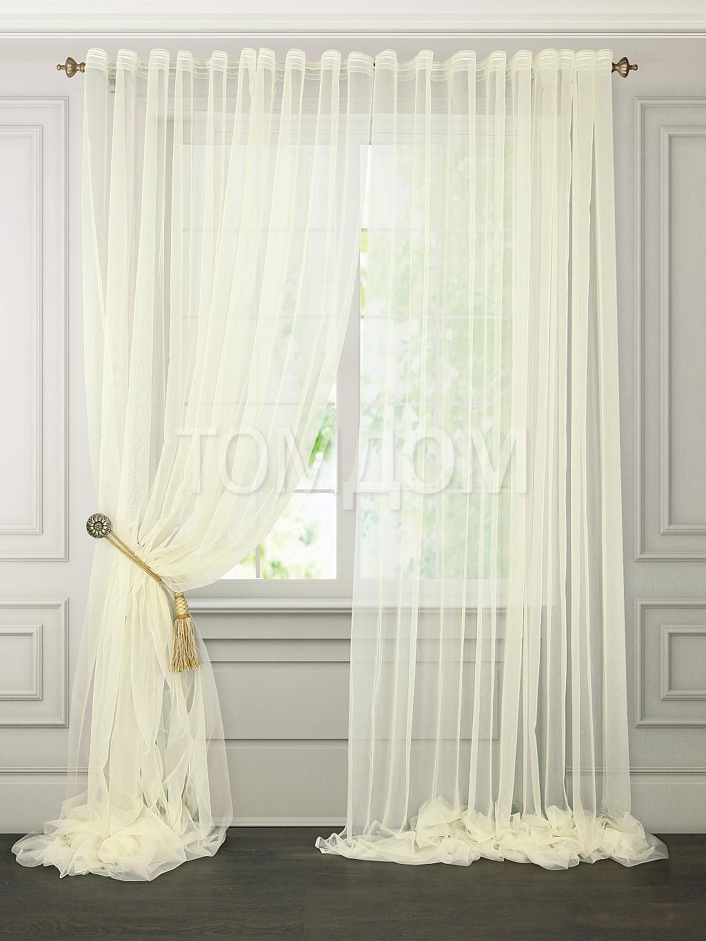
The sophistication of pearl walls can be emphasized by harmoniously selected curtains, which are selected for a cream interior according to special rules.

Firstly, curtain rods are chosen to be as neutral and simple as possible. Secondly, it is recommended to purchase the canvases themselves in a similar color scheme, but of a different tone, which will prevent them from merging into one plane. Moreover, if there is an ornament or pattern on the walls, curtains, on the contrary, should not have a pattern and vice versa.

Thirdly, you need to remember about the optimal combinations: warm tones can be combined with red, yellow, brown and gold, while cold tones look better with shades of blue, steel, purple and black.


Before you build your interior in flesh tones, you need to familiarize yourself with some tips and recommendations for using color:


Look at the photos of beige wallpaper below and appreciate the diversity of existing ones. design ideas. Neutral and boring at first glance, caramel or sand, with certain accents, can sparkle with incredible colors and enrich the interior with an amazing atmosphere.


It stands on a par with white - it’s a classic in wall decoration. When designing, designers go in two ways: use beige as a background or as the main color. Wallpaper canvases of this color look beautiful in any texture; it is important to take into account the shades and their compatibility with other colors.
Purely psychological beige color in the interior is most pleasing to the eye. After all, they are natural, natural, which is instinctively clear and close to every person. Color envelops a person with peace and stability. This is the best solution for those who do not take risks in life, for those who do not accept drastic changes. They are just right for people who consider themselves sensible and practical.
Interesting fact! The word “beige” comes from the name of one of the types of cotton fiber. It is natural, but the number of its halftones amazes the eye.
Beige tones look different:
Advice! When creating the interior of a room with beige wallpaper, it is worth considering that when the lighting changes, the shade of this color also changes. Twilight turns it into mysterious and mystical, bright light - into festive and solemn.
This wallpaper color is perfect for any room. Versatility and compatibility with your favorite color makes beige number 1.
Living room
Wallpapers, too, are different not only in shade, but also in texture. Eg - , vinyl, plant and floral ornaments.
Bedroom
This room in the house simply must radiate calm, comfort and tranquility. It is in this room that beige is easy and difficult to use at the same time. The best solution is a combination of several shades.
Important! The base as beige wallpaper must be complemented by another color, but not in dissonance with the base, there should not be a sharp contrast. This will help you tune in to rest, relax, and sleep will come faster.
The interior will not be monotonous if you buy beige ones for the bedroom. Most often these are fantasy ornaments. Not all walls should be decorated with such wallpaper. After all, they will “press” only one wall, for example, the one under which the bed stands.
Advice! It is worth using to decorate the walls in the kitchen, they react normally to extreme conditions problems that occur in the kitchen - temperature changes, moisture.
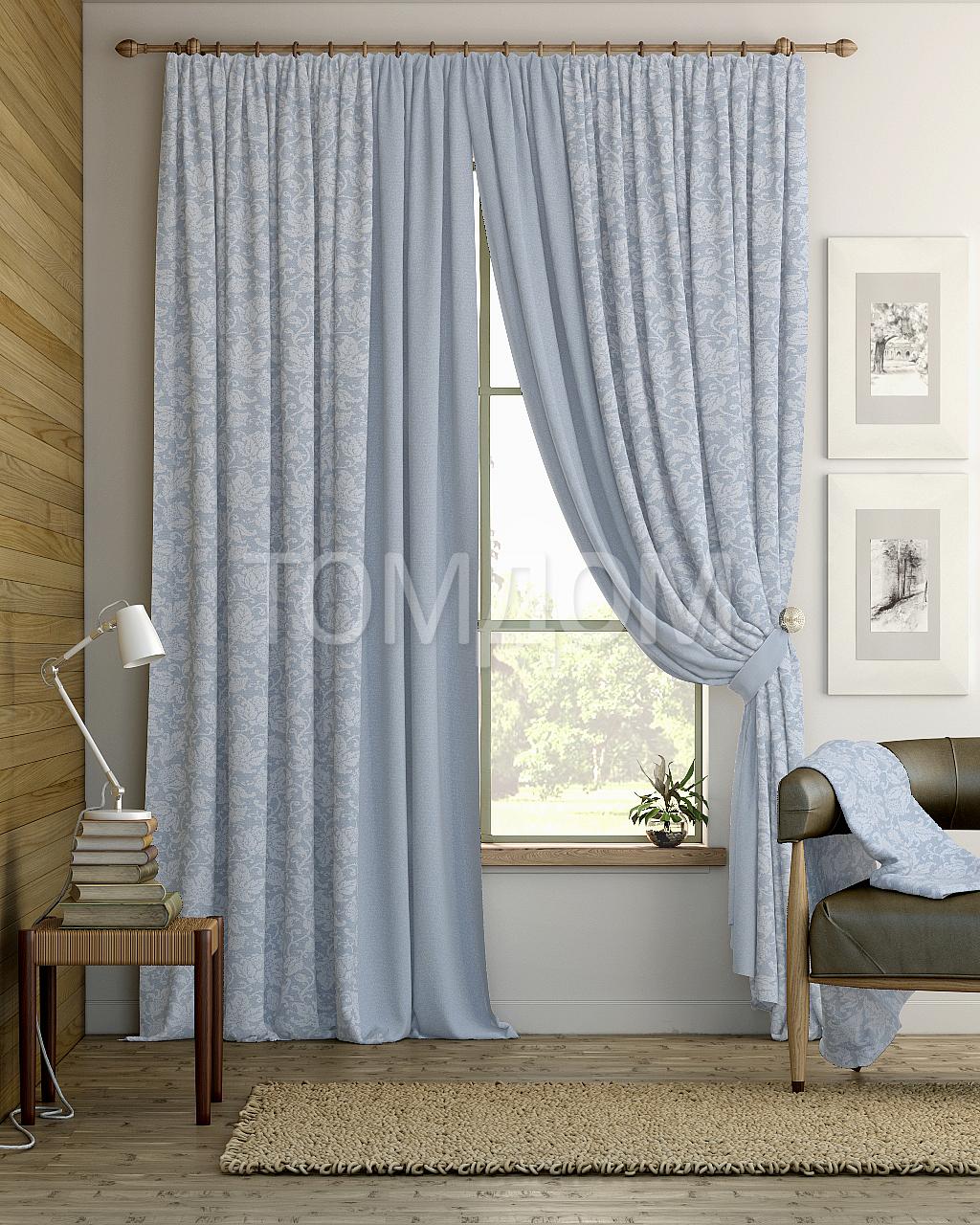
Not just wallpaper, for the unity and organicity of the interior you need. It is important to choose the right color and texture for beige wallpaper. But first, decide on the color. For warm shades the best solution would be brown, red, yellow, orange, and golden textiles. For cold tones, you should choose gray, blue, purple curtains.
Important! Any textile, not just curtains, should not repeat the shade of the wallpaper, otherwise it will be boring and inexpressive.
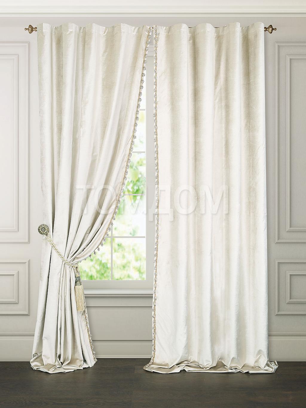
Although the color is universal and has shown itself to be excellent as a base color, using too bright curtains not worth it. It is better to focus on furniture, accessories, . It is best to choose curtains in the same color scheme as the wallpaper; the tone should be a little darker.
Advice! If wallpapers are plain and without patterns, then the curtains can have a pattern and vice versa - the presence of an ornament on the wallpaper is a contraindication for its presence on the curtains. This way the room will not look tacky.
Deep option rich color curtains are possible if they repeat color scheme furniture. At the same time, you will have to sacrifice airiness, because such an interior will be expressive.
This factor is also important for a harmonious interior with beige wallpaper. Any shade of this color goes well with light furniture. But if the walls have a basic shade, it’s worth playing on the furniture. At the same time, saturation and brightness are welcome. Combination options:


